Introduction
In an era of information overload, the ability to transform complex research findings into compelling, accessible narratives has become essential for academic success. Data visualization and storytelling are no longer optional enhancements to scholarly work—they are fundamental tools for communication, comprehension, and impact. The most influential research today combines rigorous methodology with masterful presentation, creating work that not only advances knowledge but also inspires action and understanding.
This comprehensive guide will equip you with the skills to transform your data into powerful visual narratives that engage diverse audiences, enhance comprehension, and maximize the impact of your research. Whether you’re preparing a seminar presentation, crafting a journal article, or developing public-facing content, these principles will help you communicate your findings with clarity, precision, and compelling force.
The Science of Visual Communication
Cognitive Processing and Visual Perception
Dual Coding Theory: Information processed through both visual and verbal channels creates stronger, more memorable impressions than single-channel communication. When you combine well-designed visuals with clear textual explanation, you engage multiple cognitive pathways, improving comprehension and retention.
Pre-attentive Processing: The human visual system processes certain attributes (color, motion, orientation) before conscious attention is directed. Understanding these mechanisms allows you to guide reader attention strategically through your data presentations.
Gestalt Principles in Data Design:
- Proximity: Related elements should be visually grouped
- Similarity: Similar data should share visual characteristics
- Closure: Viewers complete incomplete patterns mentally
- Continuity: The eye follows smooth, continuous lines
- Figure-Ground: Important elements should stand out from background
Working Memory and Information Processing
Cognitive Load Theory: Working memory has limited capacity (7±2 items). Effective visualizations reduce cognitive load by:
- Eliminating unnecessary visual elements (chartjunk)
- Grouping related information logically
- Using familiar visual conventions
- Progressive disclosure of complex information
The Picture Superiority Effect: Images are remembered better than words alone. Strategic use of visual metaphors, icons, and conceptual diagrams can make abstract research concepts more memorable and understandable.
Cultural and Contextual Considerations
Cross-Cultural Visual Literacy:
- Color meanings vary across cultures (red = danger in West, prosperity in China)
- Reading patterns affect layout preferences (left-to-right vs. right-to-left)
- Symbol recognition varies by cultural background
- Numerical format preferences differ globally
Disciplinary Conventions:
- STEM fields expect specific chart types and statistical presentations
- Social sciences favor different visualization approaches
- Humanities may emphasize conceptual diagrams and narrative flow
- Interdisciplinary work requires flexible visual vocabularies
Data Visualization Fundamentals
Choosing the Right Visual Format
Data Type Analysis:
Categorical Data:
- Bar charts for comparisons between groups
- Pie charts for parts-of-whole (limited categories)
- Dot plots for ranking and comparison
- Treemaps for hierarchical categorical data
Continuous Data:
- Line graphs for trends over time
- Scatter plots for relationships between variables
- Histograms for distribution visualization
- Box plots for comparing distributions across groups
Geospatial Data:
- Choropleth maps for regional comparisons
- Point maps for location-specific data
- Flow maps for movement or connection data
- Cartograms for emphasizing data over geography
Temporal Data:
- Time series plots for continuous temporal data
- Gantt charts for project timelines and durations
- Calendar heatmaps for cyclical patterns
- Animation for showing change over time
Multivariate Data:
- Small multiples for comparing across conditions
- Parallel coordinates for high-dimensional data
- Heatmaps for correlation matrices
- Network diagrams for relationship data
Design Principles for Academic Visuals
Clarity and Precision:
- Every visual element should serve a purpose
- Remove decorative elements that don’t enhance understanding
- Use consistent scales and units across comparable charts
- Provide clear, informative titles and captions
Hierarchy and Emphasis:
- Use size, color, and position to show importance
- Guide the reader’s eye through a logical sequence
- Highlight key findings while maintaining context
- Balance detail with overall comprehensibility
Accessibility and Inclusion:
- Ensure sufficient color contrast for readability
- Use patterns or shapes in addition to color coding
- Provide alternative text descriptions for all visuals
- Consider various forms of visual impairment in design choices
Advanced Visualization Techniques
Interactive Elements:
- Hover details for additional information
- Filtering and sorting capabilities
- Zoom and pan for detailed exploration
- Linked views showing multiple perspectives
Animation and Motion:
- Showing change over time
- Drawing attention to specific elements
- Explaining complex processes step-by-step
- Revealing data progressively
3D and Immersive Visualization:
- Appropriate for truly three-dimensional data
- Virtual reality for immersive data exploration
- Augmented reality for contextual data overlay
- Consider cognitive load and interpretation challenges
Storytelling Through Data
Narrative Structure in Data Presentation
The Classical Story Arc Applied to Research:
Exposition (Context Setting):
- Establish the research domain and its importance
- Introduce key concepts and terminology
- Present the current state of knowledge
- Identify the gap or problem your research addresses
Rising Action (Building Evidence):
- Present preliminary findings or pilot studies
- Show the progression of your investigation
- Build tension through unexpected results or challenges
- Introduce complications or alternative explanations
Climax (Key Discovery):
- Reveal your primary findings
- Present the moment of insight or breakthrough
- Show the data that supports your main conclusion
- Create the “aha” moment for your audience
Falling Action (Implications):
- Explain what your findings mean
- Address potential counterarguments or limitations
- Connect results to broader theoretical frameworks
- Discuss practical applications and significance
Resolution (Conclusions and Future):
- Summarize key takeaways
- Propose future research directions
- Reflect on broader implications for the field
- End with a memorable, impactful statement
Character Development in Research Narratives
The Research Journey as Hero’s Journey:
- The Call: What drew you to this research question?
- The Challenge: What obstacles or mysteries did you encounter?
- The Guide: What theories, methods, or mentors helped you?
- The Transformation: How did your understanding change?
- The Return: What knowledge do you bring back to the community?
Humanizing Data Points:
- Present study participants as real people with stories
- Include researcher reflections and decision points
- Acknowledge moments of uncertainty or surprise
- Share the human impact of your findings
Multiple Perspectives:
- Present different stakeholder viewpoints
- Include dissenting opinions or alternative interpretations
- Show how different groups might use or be affected by your findings
- Acknowledge the complexity and nuance in your results
Creating Emotional Engagement
The Power of Concrete Examples:
- Use specific cases to illustrate general principles
- Include vivid, relatable scenarios
- Connect abstract concepts to everyday experiences
- Balance statistical evidence with human stories
Building Suspense and Curiosity:
- Pose intriguing questions before revealing answers
- Use progressive disclosure to build understanding
- Create moments of surprise or contradiction
- Maintain audience engagement through pacing
Empathy and Connection:
- Help readers understand the lived experience behind data
- Connect findings to readers’ own experiences or concerns
- Show the human stakes of your research questions
- Demonstrate respect for research participants and communities
Visual Design for Academic Communication
Typography and Layout Principles
Hierarchy Through Typography:
- Use font sizes to establish information hierarchy
- Employ font weights (bold, regular, light) strategically
- Maintain consistency in heading and body text styles
- Consider font choices for readability and professionalism
White Space and Visual Breathing Room:
- Allow adequate spacing around visual elements
- Use margins and padding to prevent crowding
- Group related information through proximity
- Balance information density with comprehensibility
Grid Systems and Alignment:
- Establish consistent alignment patterns
- Use invisible grids to organize complex layouts
- Maintain visual rhythm through regular spacing
- Create visual stability through systematic organization
Color Theory for Academic Visuals
Color Psychology and Meaning:

- Blue: Trust, stability, professionalism (ideal for corporate or medical research)
- Green: Growth, nature, positive outcomes (effective for environmental or health data)
- Red: Urgency, importance, negative outcomes (use sparingly and purposefully)
- Orange: Energy, enthusiasm, creativity (good for innovation or education themes)
- Purple: Sophistication, luxury, creativity (suitable for arts or high-end research)
Functional Color Usage:
- Sequential Palettes: For ordered data (light to dark progression)
- Diverging Palettes: For data with meaningful center point (positive/negative)
- Categorical Palettes: For distinct groups (maximally different hues)
- Highlighting Palettes: Neutral background with accent colors for emphasis
Accessibility in Color Choice:
- Test designs with colorblind simulation tools
- Ensure sufficient contrast ratios (4.5:1 minimum for normal text)
- Use patterns, textures, or shapes alongside color coding
- Provide alternative text descriptions for color-coded information
Creating Professional Infographics
Research Infographic Types:
Process Infographics: Show methodological steps, theoretical frameworks, or causal chains
- Use flowcharts and process diagrams
- Include decision points and feedback loops
- Show temporal progression clearly
- Balance detail with comprehensibility
Statistical Infographics: Present key findings in visually appealing formats
- Combine multiple chart types strategically
- Use iconography to represent quantities
- Create visual comparisons and contrasts
- Maintain statistical accuracy while enhancing appeal
Conceptual Infographics: Illustrate abstract ideas through visual metaphors
- Use analogies and familiar imagery
- Create conceptual frameworks and models
- Show relationships between ideas
- Bridge abstract theory with concrete visualization
Timeline Infographics: Show historical development or research progression
- Use chronological organization
- Include key milestones and turning points
- Show cause-and-effect relationships over time
- Balance historical context with current relevance
Tools and Software for Academic Visualization
Professional Design Software:
- Adobe Creative Suite (Illustrator, InDesign, Photoshop): Industry standard for professional graphics
- Figma: Collaborative design platform with academic pricing
- Canva Pro: User-friendly with academic templates and resources
- Sketch: Mac-specific design tool with extensive plugin ecosystem
Data Visualization Platforms:
- Tableau: Powerful business intelligence tool with academic licensing
- Power BI: Microsoft’s business analytics platform
- D3.js: JavaScript library for custom web-based visualizations
- Observable: Online platform for interactive data visualization
Academic-Specific Tools:
- R (ggplot2): Statistical computing with excellent visualization capabilities
- Python (matplotlib, seaborn, plotly): Programming language with extensive viz libraries
- MATLAB: Technical computing platform with built-in visualization functions
- Origin: Scientific graphing and data analysis software
Free and Open-Source Options:
- GIMP: Free alternative to Photoshop
- Inkscape: Free vector graphics editor
- Gephi: Network analysis and visualization
- Google Charts: Free web-based charting tools
Balancing Technical Detail with Narrative Flow
Layered Information Architecture
The Inverted Pyramid Approach:
- Headline Level: Key finding in simple terms
- Summary Level: Essential details and context
- Detail Level: Full technical specifications and methodology
- Deep Dive Level: Complete statistical analyses and supplementary information
Progressive Disclosure Strategies:
- Main text provides overview and key insights
- Figures and tables offer additional detail
- Captions explain technical aspects
- Supplementary materials contain full technical details
- Appendices house raw data and complete analyses
Managing Complexity Without Overwhelming
Chunking Complex Information:
- Break large datasets into meaningful subsets
- Use small multiples to show patterns across conditions
- Create dashboard-style layouts for comprehensive overviews
- Provide navigation aids for complex multi-part visualizations
Contextual Scaffolding:
- Provide background information before presenting complex data
- Use familiar analogies to explain unfamiliar concepts
- Build complexity gradually through sequential presentation
- Include glossaries or definition sidebars for technical terms
Interactive Complexity Management:
- Allow users to filter or subset data based on interest
- Provide overview-first, then details-on-demand
- Use progressive revelation in presentation contexts
- Create multiple entry points for different audience needs
Writing Effective Captions and Descriptions
Caption Structure for Academic Figures:
- Title: Clear, descriptive heading
- Description: What the figure shows
- Key Findings: What patterns or results are most important
- Technical Details: Sample sizes, statistical tests, significance levels
- Interpretation Guidance: How to read or interpret the visualization
Example Caption Structure:
Figure 1. Mean reaction times across experimental conditions show significant main effects of stimulus type and participant age.
(A) Younger participants (ages 18-25, n=45) showed faster reaction times to visual stimuli compared to auditory stimuli (visual: M=342ms, SD=23ms; auditory: M=398ms, SD=31ms; t(44)=12.3, p<0.001).
(B) Older participants (ages 65-75, n=42) showed the opposite pattern, with faster responses to auditory stimuli (visual: M=445ms, SD=39ms; auditory: M=401ms, SD=28ms; t(41)=8.7, p<0.001).
Error bars represent standard error of the mean. Asterisks indicate statistical significance (*p<0.05, **p<0.01, ***p<0.001).
Alternative Text for Accessibility:
- Describe the chart type and overall pattern
- Include specific data points for key findings
- Explain trends, relationships, or comparisons shown
- Provide context for understanding the visualization’s purpose
Storytelling Across Different Mediums
Written Articles with Embedded Narratives
Integrating Story Elements in Academic Writing:
- Opening Hooks: Start with compelling questions, surprising statistics, or vivid examples
- Transition Narratives: Use mini-stories to bridge between sections
- Case Study Integration: Weave specific examples throughout analytical sections
- Conclusion Callbacks: Return to opening stories or questions for closure
Maintaining Academic Rigor While Storytelling:
- Ground all narrative elements in empirical evidence
- Use story elements to illuminate, not replace, analytical content
- Maintain objective tone while incorporating engaging elements
- Provide clear distinctions between illustrative examples and systematic findings
Presentation and Seminar Contexts
Visual Storytelling for Live Audiences:
- Opening Impact: Start with striking visuals that establish stakes
- Progressive Revelation: Build understanding through sequential disclosure
- Rhythm and Pacing: Alternate between data-heavy and narrative sections
- Interactive Moments: Include opportunities for audience engagement
Slide Design for Academic Presentations:
- One key point per slide
- Minimal text with strong visual support
- Consistent design language throughout
- Clear slide transitions that maintain narrative flow
- Backup slides with additional detail for questions
Digital and Interactive Formats
Web-Based Research Communication:
- Scrollytelling: Combine scrolling with progressive data revelation
- Interactive Dashboards: Allow audiences to explore data independently
- Multimedia Integration: Combine text, visuals, audio, and video
- Social Media Adaptation: Create shareable visualizations and insights
Virtual and Augmented Reality Applications:
- Immersive data exploration experiences
- 3D visualization of complex spatial data
- Virtual laboratory or field site tours
- Collaborative data analysis in shared virtual spaces
Case Studies and Examples Across Disciplines
STEM Field Applications
Medical Research Visualization:
- Challenge: Communicating complex clinical trial results to diverse stakeholders
- Solution: Interactive patient journey maps showing treatment progression
- Narrative Element: Following representative patients through treatment protocols
- Impact: Improved understanding among patients, families, and healthcare providers
Environmental Science Communication:
- Challenge: Making climate change data personally relevant and actionable
- Solution: Localized impact visualizations with before/after scenarios
- Narrative Element: Community-specific stories of environmental change
- Impact: Increased engagement with climate science and policy support
Engineering Innovation Presentation:
- Challenge: Explaining technical innovations to non-technical audiences
- Solution: Step-by-step visual breakdowns with real-world analogies
- Narrative Element: Problem-solution story arc with user benefit focus
- Impact: Better funding support and technology adoption
Social Sciences and Humanities
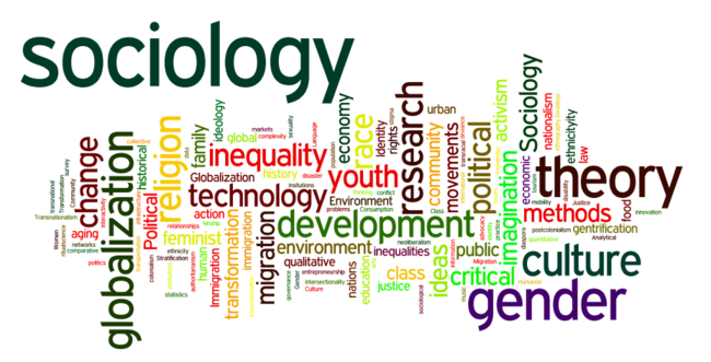
Sociological Research Communication:
- Challenge: Illustrating complex social patterns and inequalities
- Solution: Multi-layered visualizations showing individual and aggregate patterns
- Narrative Element: Personal stories illustrating broader social trends
- Impact: Enhanced public understanding of social issues and policy implications
Historical Research Presentation:
- Challenge: Making historical data relevant to contemporary audiences
- Solution: Interactive timelines with contemporary parallels and implications
- Narrative Element: Character-driven historical narratives with modern connections
- Impact: Increased appreciation for historical context in current debates
Psychological Research Visualization:
- Challenge: Explaining abstract cognitive processes and mental health concepts
- Solution: Visual metaphors and process diagrams with concrete examples
- Narrative Element: Case studies and personal experiences (with appropriate privacy protection)
- Impact: Reduced stigma and improved understanding of mental health issues
Interdisciplinary Research Examples
Public Health Communication:
- Challenge: Communicating complex epidemiological data during health crises
- Solution: Real-time dashboards with clear action guidance
- Narrative Element: Community impact stories and individual prevention narratives
- Impact: Improved public health compliance and decision-making
Educational Research Application:
- Challenge: Showing learning outcomes and pedagogical effectiveness
- Solution: Student journey visualizations with outcome comparisons
- Narrative Element: Student success stories and teacher experience accounts
- Impact: Better educational policy decisions and teaching practice improvements
Measuring Impact and Effectiveness
Quantitative Assessment Methods
Engagement Metrics:
- Time spent viewing visualizations
- Click-through rates on interactive elements
- Social media shares and comments
- Download rates for supplementary materials
- Conference presentation attendance and feedback scores
Comprehension Testing:
- Pre/post knowledge assessments
- Retention testing over time
- Comprehension comparison between different presentation formats
- Error rates in interpretation or application of findings
- Speed of understanding complex concepts
Behavioral Impact Measures:
- Citation rates and academic influence
- Policy adoption or recommendation implementation
- Media coverage and public discussion generation
- Funding or collaboration opportunities created
- Career advancement and recognition metrics
Qualitative Feedback Collection
Audience Response Gathering:
- Focus groups with representative audience segments
- In-depth interviews with key stakeholders
- Open-ended survey responses about impact and understanding
- Peer review feedback on communication effectiveness
- Expert evaluation of visualization quality and accuracy
Iterative Improvement Processes:
- A/B testing different visualization approaches
- User experience testing for interactive elements
- Accessibility auditing for diverse audiences
- Cross-cultural validation of visual metaphors and symbols
- Longitudinal tracking of communication effectiveness
Professional Development and Skill Building
Building Visualization Literacy:
- Formal coursework in data visualization and graphic design
- Workshops on storytelling techniques for academics
- Professional development in presentation and communication skills
- Collaboration with graphic designers and communication specialists
- Participation in science communication training programs
Community Engagement and Learning:
- Joining professional organizations focused on research communication
- Attending conferences on data visualization and science communication
- Participating in online communities and forums
- Following best practices from journalism and data visualization experts
- Engaging with public audiences through outreach and education programs
Ethical Considerations in Data Visualization
Representation and Bias
Avoiding Visual Manipulation:
- Use appropriate scales and avoid truncated axes
- Represent uncertainty and confidence intervals honestly
- Avoid cherry-picking data points or time periods
- Include context that might change interpretation
- Acknowledge limitations and potential biases explicitly
Inclusive Representation:
- Ensure diverse representation in imagery and examples
- Avoid stereotyping in visual metaphors and illustrations
- Consider cultural sensitivity in color choices and symbols
- Include multiple perspectives and voices in narratives
- Address power dynamics and structural inequalities
Privacy and Consent
Protecting Participant Privacy:
- Anonymize or aggregate data appropriately
- Obtain proper consent for use of personal stories or images
- Consider re-identification risks in detailed visualizations
- Follow institutional review board guidelines for data presentation
- Balance transparency with privacy protection
Data Ownership and Attribution:
- Properly credit data sources and collaborators
- Respect intellectual property rights in visualization design
- Acknowledge community contributions to research
- Follow open science principles when appropriate
- Consider data sovereignty issues in community-based research
Future Trends and Emerging Technologies
Artificial Intelligence and Machine Learning
AI-Assisted Visualization Creation:
- Automated chart type selection based on data characteristics
- Natural language generation of visualization descriptions
- Pattern recognition for identifying key insights in complex datasets
- Style transfer for maintaining consistent visual branding
- Real-time visualization updates based on streaming data
Machine Learning for Audience Personalization:
- Adaptive interfaces that adjust to user expertise levels
- Personalized content recommendations based on interests
- Dynamic visualization complexity based on user engagement
- Automated translation of technical content for different audiences
- Predictive modeling of communication effectiveness
Immersive and Interactive Technologies
Virtual and Augmented Reality Applications:
- Immersive data exploration in 3D environments
- Collaborative virtual research presentations
- Augmented reality overlays for contextual data presentation
- Haptic feedback for multi-sensory data experience
- Virtual field trips and laboratory experiences
Advanced Interaction Paradigms:
- Voice-controlled data exploration
- Gesture-based interaction with visualizations
- Eye-tracking for attention and comprehension analysis
- Brain-computer interfaces for direct thought-to-visualization
- Multi-modal interaction combining touch, voice, and gesture
Collaborative and Social Visualization
Crowdsourced Data Analysis:
- Citizen science visualization platforms
- Collaborative annotation and interpretation tools
- Distributed expertise in complex data analysis
- Community-driven research question generation
- Democratic participation in scientific discovery
Social Learning and Knowledge Sharing:
- Peer-to-peer learning through shared visualizations
- Community-curated best practices and examples
- Collaborative storytelling around research findings
- Social validation of interpretation and insights
- Cross-disciplinary knowledge transfer through visualization
Conclusion
The integration of data visualization and storytelling in academic communication represents more than a stylistic choice—it’s a fundamental shift toward more effective, inclusive, and impactful scholarship. As the volume of research continues to grow exponentially, the ability to communicate findings clearly and compellingly becomes increasingly crucial for advancing knowledge and influencing positive change.
The techniques and principles outlined in this guide provide a foundation for transforming your research into powerful narratives that engage, inform, and inspire. Whether you’re visualizing complex datasets, crafting compelling seminar presentations, or developing public-facing content, these skills will help you bridge the gap between specialized knowledge and broader understanding.
Success in academic communication requires balancing multiple considerations: maintaining scientific rigor while achieving accessibility, respecting ethical obligations while maximizing impact, and leveraging new technologies while preserving human connection. The most effective research communication combines technical excellence with emotional resonance, creating work that not only advances knowledge but also motivates action and change.
As emerging technologies continue to expand the possibilities for data visualization and storytelling, the fundamental principles of clear communication, ethical practice, and audience-centered design will remain central to effective academic communication. By mastering these elements and staying adaptable to new tools and methods, you’ll be well-positioned to make your research accessible, memorable, and influential.
The future of academic communication lies in the skillful integration of data, narrative, and visual design. When you combine rigorous research with compelling storytelling and thoughtful visualization, you create work that doesn’t just inform—it transforms understanding and inspires action. This is the ultimate goal of scholarly communication: not just to add to the sum of human knowledge, but to make that knowledge accessible, meaningful, and transformative for diverse audiences and communities.
Your research has the potential to make a significant impact on the world. Through thoughtful application of data visualization and storytelling principles, you can ensure that your important work reaches, engages, and influences the audiences who need it most. The investment in these communication skills will pay dividends not only in academic success but in the broader impact of your contributions to knowledge and society.